Today's
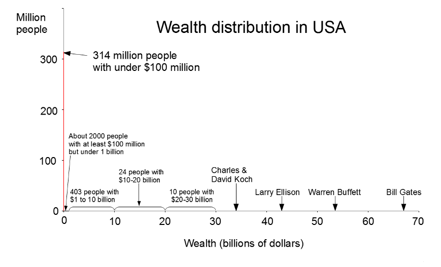
Forbes billionaires list inspired me to visualize the wealth inequality in the United States. Use the Forbes list and other sources, I've created a graph that shows wealth distribution in the United States. It turns out that if you put Bill Gates on a linear graph of wealth, pretty much the entire US population is crammed into a one-pixel bar around 0.

This graph shows the wealth distribution in red. Note that the visible red line is one pixel wide and disappears everywhere else - this is the key point: essentially the entire US population is in that first bar. The graph is drawn with the scale of 1 pixel = $100 million in the X axis, and 1 pixel = 1 million people in the Y axis. Away from the origin, the red line is invisible - less than 1/1000 of a pixel tall since so few people have more than $100 million dollars. It's striking just how much money Bill Gates has; even $100 million is negligible in comparison.
Since the median US household wealth is about $100,000, half the population is crammed into a microscopic red line 1/1000 of a pixel wide. (The line would be narrower than the wavelength of light so it would be literally invisible). And it turns out the 1-pixel-wide red line isn't just the "99%", but the 99.999%. I hypothesize this is why even many millionaires don't feel rich.
Wealth inequality among billionaires
Much has been written about inequality in the US between the rich and the poor, but it turns out there is also huge inequality among the ranks of billionaires.
Looking at the 1.9 trillion dollars held by US billionaires, it turns out that the top 20% of billionaires have 59% of this wealth, while the bottom 20% of billionaires have less than 6%. So even among billionaires, most of the money is skewed to the top.
(I originally pointed this out in Forbes in
1998, and the billionaire inequality has grown slightly since then.)
Sources
The billionaire data is from
Forbes billionaires list 2013. Median wealth is from
Wikipedia. Also
Measuring the Top 1% by Wealth, Not Income and
More millionaires despite tough times. Wealth data has a lot of sources of error including people vs households, what gets counted, and changing time periods, but I've tried to make this graph as accurate as possible. I should also mention that wealth and income are two very different things; this post looks strictly at wealth.

Fascinating analysis. So how have the Koch brothers managed to mobilize a sizeable percentage of the US population (the "Tea Party") to protect their interests - which are really only of those of a handful of billionaires? And at least two of those billionaires (Buffet, Gates) would appear to disagree with the general thrust of Tea Party policy.
ReplyDeleteThank you for the comment, Paul. One thing that may not be clear on my graph is David Koch and Charles Koch have $34 billion each; together they have more than Bill Gates.
ReplyDeleteBuffet = government mandated insurance
ReplyDeleteEllison = government databases & police state
Koch = government subsidized coal industry
There's a very long list of regulatory capture billionaires.
Even historically, what catapulted the big 3 automakers ahead of all the others was not better technology but the fact that they got government contracts and the others didn't.
"Behind every great fortune there is a great crime."
ReplyDeleteDuring WWII Packard got the single best contract-manufacturing the Rolls Royce Merlin aeroengine with its two stage, two speed centrifugal blower. They also had a huge PT boat engine contract. Nevertheless they were out of business by 1956.
ReplyDelete