Showing posts with label random. Show all posts

Wealth distribution in the United States

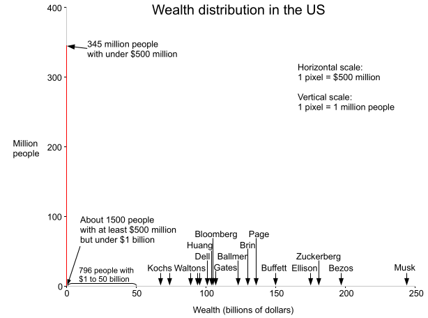
Forbes recently published the Forbes 400 List for 2024, listing the 400 richest people in the United States. This inspired me to make a histogram to show the distribution of wealth in the United States. It turns out that if you put Elon Musk on the graph, almost the entire US population is crammed into a vertical bar, one pixel wide. Each pixel is $500 million wide, illustrating that $500 million essentially rounds to zero from the perspective of the wealthiest Americans.

Graph showing the wealth distribution in the United States.

The histogram above shows the wealth distribution in red. Note that the visible red line is one pixel wide at the left and disappears everywhere else—this is the important point: essentially the entire US population is in that first bar. The graph is drawn with the scale of 1 pixel = $500 million in the X axis, and 1 pixel = 1 million people in the Y axis. Away from the origin, the red line is invisible—a tiny fraction of a pixel tall since so few people have more than 500 million dollars.

Since the median US household wealth is about $190,000, half the population would be crammed into a microscopic red line 1/2500 of a pixel wide using the scale above. (The line would be much narrower than the wavelength of light so it would be literally invisible). The very rich are so rich that you could take someone with a thousand times the median amount of money, and they would still have almost nothing compared to the richest Americans. If you increased their money by a factor of a thousand yet again, you'd be at Bezos' level, but still well short of Elon Musk.

Another way to visualize the extreme distribution of wealth in the US is to imagine everyone in the US standing up while someone counts off millions of dollars, once per second. When your net worth is reached, you sit down. At the first count of $1 million, most people sit down, with 22 million people left standing. As the count continues—$2 million, $3 million, $4 million—more people sit down. After 6 seconds, everyone except the "1%" has taken their seat. As the counting approaches the 17-minute mark, only billionaires are left standing, but there are still days of counting ahead. Bill Gates sits down after a bit over one day, leaving 8 people, but the process is nowhere near the end. After about two days and 20 hours of counting, Elon Musk finally sits down.

Sources

The main source of data is the Forbes 400 List for 2024. Forbes claims there are 813 billionaires in the US here. Median wealth data is from the Federal Reserve; note that it is from 2022 and household rather than personal. The current US population estimate is from Worldometer. I estimated wealth above $500 million, extrapolating from 2019 data.

I made a similar graph in 2013; you can see my post here for comparison.

Disclaimers: Wealth data has a lot of sources of error including people vs households, what gets counted, and changing time periods, but I've tried to make this graph as accurate as possible. I'm not making any prescriptive judgements here, just presenting the data. Obviously, if you want to see the details of the curve, a logarithmic scale makes more sense, but I want to show the "true" shape of the curve. I should also mention that wealth and income are very different things; this post looks strictly at wealth.

Intel x86 documentation has more pages than the 6502 has transistors

Microprocessors have become immensely more complex thanks to Moore's Law, but one thing that has been lost is the ability to fully understand them. The 6502 microprocessor was simple enough that its instruction set could almost be memorized. But now processors are so complex that understanding their architecture and instruction set even at a superficial level is a huge task. I've been reverse-engineering parts of the 6502, and with some work you can understand the role of each transistor in the 6502. After studying the x86 instruction set, I started wondering which was bigger: the number of transistors in the 6502 or the number of pages of documentation for the x86.

It turns out that Intel's Intel® 64 and IA-32 Architectures Software Developer Manuals (2011) have 4181 pages in total, while the 6502 has 3510 transistors. There are actually more pages of documentation for the x86 than the number of individual transistors in the 6502.

The above photo shows Intel's IA-32 software developer's manuals from 2004 on top of the 6502 chip's schematic. Since then the manuals have expanded to 7 volumes.

The 6502 has 3510 transistors, or 4528, or 6630, or maybe 9000?

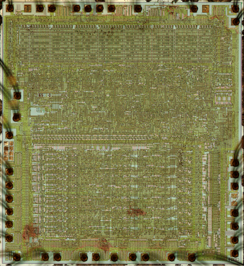
As a slight tangent, it's actually hard to define the transistor count of a chip. The 6502 is usually reported as having 3510 transistors. This comes from the Visual 6502 team, which dissolved a 6502 chip in acid, photographed the die (below), traced every transistor in the image, and built a transistor-level simulator that runs 6502 code (which you really should try). Their number is 3510 transistors.

The 6502 processor chip

One complication is the 6502 is built with NMOS logic which builds gates out of active "enhancement" transistors as well as pull-up "depletion" transistors which basically act as resistors. The count of 3510 is just the enhancement transistors. If you include the 2102 1018 depletion transistors, the total transistor count is 5612 4528.

A second complication is that when manufacturers report the transistor count of chips, they often report "potential" transistors. Chips that include a ROM or PLA will have different numbers of transistors depending on the values stored in the ROM. Since marketing doesn't want to publish different transistor numbers depending on the number of 1 bits and 0 bits programmed into the chip, they often count ROM or PLA sites: places that could have transistors, but might not. By my count, the 6502 decode PLA has 21×131=2751 PLA sites, of which 649 actually have transistors. Adding these 2102 "potential" transistors yields a count of 6630 transistors.

Finally, some sources such as Microsoft Encarta and A History of the Personal Computer state the 6502 contains 9000 transistors, but I don't know how they could have come up with that value.

(The number of pages of Intel documentation is also not constant; the latest 2013 Software Developer Manuals have shrunk to 3251 pages.)

Thus, the x86 has more pages of documentation than the 6502 has transistors, but it depends how you count.

9 Hacker News comments I'm tired of seeing

As a long-time reader of Hacker News, I keep seeing some comments they don't really contribute to the conversation. Since the discussions are one of the most interesting parts of the site I offer my suggestions for improving quality.
  • Correlation is not causation: the few readers who don't know this already won't benefit from mentioning it. If there's some specific reason you think a a study is wrong, describe it.
  • "If you're not paying for it, you're the product" - That was insightful the first time, but doesn't need to be posted about every free website.
  • Explaining a company's actions by "the legal duty to maximize shareholder value" - Since this can be used to explain any action by a company, it explains nothing. Not to mention the validity of the statement is controversial.
  • [citation needed] - This isn't Wikipedia, so skip the passive-aggressive comments. If you think something's wrong, explain why.
  • Premature optimization - labeling every optimization with this vaguely Freudian phrase doesn't make you the next Knuth. Calling every abstraction a leaky abstraction isn't useful either.
  • Dunning-Kruger effect - an overused explanation and criticism.
  • Betteridge's law of headlines - this comment doesn't need to appear every time a title ends in a question mark.
  • A link to a logical fallacy, such as ad hominem or more pretentiously tu quoque - this isn't a debate team and you don't score points for this.
  • "Cue the ...", "FTFY", "This.", "+1", "Sigh", "Meh", and other generic internet comments are just annoying.
My readers had a bunch of good suggestions. Here are a few:
  • The plural of anecdote is not data
  • Cargo cult
  • Comments starting with "No." "Wrong." or "False."
  • Just use bootstrap / heroku / nodejs / Haskell / Arduino.
  • "How [or Why] did this make the front page of HN?" followed by http://ycombinator.com/newsguidelines.html
In general if a comment could fit on a bumper sticker or is simply a link to a Wikipedia page or is almost a Hacker News meme, it's probably not useful.

What comments bother you the most?

Check out the long discussion at Hacker News. Thanks for visiting, HN readers!

Amusing note: when I saw the comments below, I almost started deleting them thinking "These are the stupidest comments I've seen in a long time". Then I realized I'd asked for them :-)

Edit: since this is getting a lot of attention, I'll add my "big theory" of Internet discussions.

There are three basic types of online participants: "watercooler", "scientific conference", and "debate team". In "watercooler", the participants are having an entertaining conversation and sharing anecdotes. In "scientific conference", the participants are trying to increase knowledge and solve problems. In "debate team", the participants are trying to prove their point is right.

HN was originally largely in the "scientific conference" mode, with very smart people discussing areas in which they were experts. Now HN has much more "watercooler" flavor, with smart people chatting about random things they often know little about. And certain subjects (e.g. economics, Apple, sexism, piracy) bring out the "debate team" commenters. Any of the three types can carry on happily by themself. However, much of the problem comes when the types of conversation mix. The "watercooler" conversations will annoy the "scientific conference" readers, since half of what they say is wrong. Conversely, the "scientific conference" commenters come across as pedantic when they interrupt a fun conversation with facts and corrections. A conversation between "debate team" and one of the other groups obviously goes nowhere.

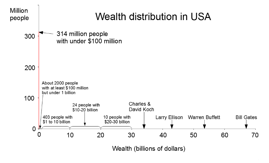
Wealth distribution in the United States

Today's Forbes billionaires list inspired me to visualize the wealth inequality in the United States. Use the Forbes list and other sources, I've created a graph that shows wealth distribution in the United States. It turns out that if you put Bill Gates on a linear graph of wealth, pretty much the entire US population is crammed into a one-pixel bar around 0.

This graph shows the wealth distribution in red. Note that the visible red line is one pixel wide and disappears everywhere else - this is the key point: essentially the entire US population is in that first bar. The graph is drawn with the scale of 1 pixel = $100 million in the X axis, and 1 pixel = 1 million people in the Y axis. Away from the origin, the red line is invisible - less than 1/1000 of a pixel tall since so few people have more than $100 million dollars. It's striking just how much money Bill Gates has; even $100 million is negligible in comparison.

Since the median US household wealth is about $100,000, half the population is crammed into a microscopic red line 1/1000 of a pixel wide. (The line would be narrower than the wavelength of light so it would be literally invisible). And it turns out the 1-pixel-wide red line isn't just the "99%", but the 99.999%. I hypothesize this is why even many millionaires don't feel rich.

Wealth inequality among billionaires

Much has been written about inequality in the US between the rich and the poor, but it turns out there is also huge inequality among the ranks of billionaires. Looking at the 1.9 trillion dollars held by US billionaires, it turns out that the top 20% of billionaires have 59% of this wealth, while the bottom 20% of billionaires have less than 6%. So even among billionaires, most of the money is skewed to the top. (I originally pointed this out in Forbes in 1998, and the billionaire inequality has grown slightly since then.)

Sources

The billionaire data is from Forbes billionaires list 2013. Median wealth is from Wikipedia. Also Measuring the Top 1% by Wealth, Not Income and More millionaires despite tough times. Wealth data has a lot of sources of error including people vs households, what gets counted, and changing time periods, but I've tried to make this graph as accurate as possible. I should also mention that wealth and income are two very different things; this post looks strictly at wealth.

The Mathematics of Volleyball

Recently I was at a multi-day volleyball tournament, which gave me plenty of time to ponder the mathematics of the game. At different points in the game, I'd wonder what the odds were of each team winning. And when a team gained or lost a point, I'd wonder how important that point was. Clearly, if the score was 24-24, gaining a point made a huge difference. But how much difference did getting one point at the beginning of the game matter? It seemed like it didn't matter much, but did it?

I decided to analyze the game mathematically. I made the simplifying assumption that each team had 50-50 odds of winning each point. I found the analysis interesting, and it turns out to have close ties to Pascal's Triangle, so I'm posting it here in case anyone else is interested.

Volleyball games are scored using the rally point system, which means that one team gets a point on every serve. (Back in the olden days, volleyball used side-out scoring, which meant that only the serving team could get a point. Fortunately, rally point scoring is more mathematically tractable. Rally point scoring also keeps the game advancing faster.) The winner of each match is the best out of three sets (a set is the same as a game). In the league I was watching, the winner of a game is the first team to get 25 points and be ahead by at least 2. (Except if a third tiebreaker game is needed, it only goes to 15 points instead of 25.)

A few cases are easy to analyze mathematically. If we assume each team has a 50-50 chance of scoring each point and the score is tied, each team obviously has a 50% chance of winning the game. (With side-out scoring, it makes a difference which team is serving, but for rally point scoring we avoid that complication.) The second obvious case is if a team has 25 points and the other team has 23 or fewer points, the first team has 100% chance of winning (since they already won).

I will use the notation P(m,n) for the chance of the first team wining if the score is m to n. From above, P(n, n) = 50%, P(25, n) = 100% for n <= 23, and P(m, 25) = 0% for m <= 23.

The chance of winning in other cases can be calculated from the assumption that a team has a 50% chance of winning the point, and a 50% chance of losing: the chance of winning is the average of these two circumstances. Mathematically, we get the simple recurrence:

For instance, if the score is 25-24, if the first team scores, they win. If the second team scores, then the score is tied. In the first (winning) case, the first team wins 100%, and in the second (tied) case, the first team wins 50%. Thus, on average they will win 75% of the time from a 25-24 lead. That is, P(25, 24) = 75%, and by symmetry P(24, 25) = 25%. (Surprisingly, these are the only scores where the requirement to win by 2 points changes the odds.)

Likewise, if the score is 24-23, half the time the first team will score a point and win, and half the time the second team will score a point and tie. So the first team has 1/2 * 100% + 1/2 * 50% = 75% chance of winning, and P(24, 23) = 75%.

More interesting is if the score is 24-22, half the time the first team will score a point and win, and half the time the second team will score, making the score 24-23. We know from above that the first team has a 75% chance of winning from 24-23, so P(24, 22) = 1/2 * 100% + 1/2 * 75% = 87.5%.

We can use the recurrence to work backwards and find the probability of winning from any score. The following table shows the probability of winning for each score. The first team has the score on the left, and the second team has the score on the top.

Table with odds of winning when the score is m to n

012345678910111213141516171819202122232425
050%44%39%33%28%23%18%14%11%8%5%4%2%1%1%0%0%0%0%0%0%0%0%0%0%0%
156%50%44%38%33%27%22%17%13%10%7%5%3%2%1%1%0%0%0%0%0%0%0%0%0%0%
261%56%50%44%38%32%27%21%17%13%9%7%4%3%2%1%1%0%0%0%0%0%0%0%0%0%
367%62%56%50%44%38%32%26%21%16%12%9%6%4%3%1%1%0%0%0%0%0%0%0%0%0%
472%67%62%56%50%44%37%31%26%20%16%11%8%6%4%2%1%1%0%0%0%0%0%0%0%0%
577%73%68%62%56%50%44%37%31%25%20%15%11%7%5%3%2%1%0%0%0%0%0%0%0%0%
682%78%73%68%63%56%50%43%37%30%24%19%14%10%7%4%3%1%1%0%0%0%0%0%0%0%
786%83%79%74%69%63%57%50%43%36%30%24%18%13%9%6%4%2%1%1%0%0%0%0%0%0%
889%87%83%79%74%69%63%57%50%43%36%29%23%17%12%8%5%3%2%1%0%0%0%0%0%0%
992%90%87%84%80%75%70%64%57%50%43%36%29%22%16%11%8%5%3%1%1%0%0%0%0%0%
1095%93%91%88%84%80%76%70%64%57%50%43%35%28%21%15%11%7%4%2%1%0%0%0%0%0%
1196%95%93%91%89%85%81%76%71%64%57%50%42%35%27%20%14%9%6%3%2%1%0%0%0%0%
1298%97%96%94%92%89%86%82%77%71%65%58%50%42%34%26%19%13%8%5%2%1%0%0%0%0%
1399%98%97%96%94%93%90%87%83%78%72%65%58%50%42%33%25%18%12%7%4%2%1%0%0%0%
1499%99%98%97%96%95%93%91%88%84%79%73%66%58%50%41%32%24%17%11%6%3%1%0%0%0%
15100%99%99%99%98%97%96%94%92%89%85%80%74%67%59%50%41%31%23%15%9%5%2%1%0%0%
16100%100%99%99%99%98%97%96%95%92%89%86%81%75%68%59%50%40%30%21%13%7%3%1%0%0%
17100%100%100%100%99%99%99%98%97%95%93%91%87%82%76%69%60%50%40%29%19%11%5%2%0%0%
18100%100%100%100%100%100%99%99%98%97%96%94%92%88%83%77%70%60%50%39%27%17%9%4%1%0%
19100%100%100%100%100%100%100%99%99%99%98%97%95%93%89%85%79%71%61%50%38%25%14%6%2%0%
20100%100%100%100%100%100%100%100%100%99%99%98%98%96%94%91%87%81%73%62%50%36%23%11%3%0%
21100%100%100%100%100%100%100%100%100%100%100%99%99%98%97%95%93%89%83%75%64%50%34%19%6%0%
22100%100%100%100%100%100%100%100%100%100%100%100%100%99%99%98%97%95%91%86%77%66%50%31%12%0%
23100%100%100%100%100%100%100%100%100%100%100%100%100%100%100%99%99%98%96%94%89%81%69%50%25%0%
24100%100%100%100%100%100%100%100%100%100%100%100%100%100%100%100%100%100%99%98%97%94%88%75%50%25%
25100%100%100%100%100%100%100%100%100%100%100%100%100%100%100%100%100%100%100%100%100%100%100%100%75%50%

Any particular chance of winning can be easily read from the table. For instance, if the score is 15-7, look where row 15 and column 7 meet, and you'll find that the first team has a 94% chance of winning. (This is P(15, 7) in my notation.)

The table illustrates several interesting characteristics of scores. The odds fall away from 50% pretty rapidly as you move away from the diagonal (i.e. away from a tied score). Points matter a lot more near the end of the game, though: you've only got a 1% chance of winning from an 18-24 position, while being six points behind at the beginning (0-6) still gives you an 18% chance of winning. However, a big deficit is almost insurmountable - if you're behind 0-15, you have less than a 1% chance of catching up and winning. (Note that 0% and 100% in the table are not exactly 0% and 100%, because there's always some chance to win or lose.)

Note that each score is the average of the score below and the score to the right - these are the cases where the first team gets the point and the second team gets the point. This corresponds directly to the equation above.

The table could be extended arbitrarily far if neither team gets a two point lead, but those cases are not particularly interesting.

Generating the score table with dynamic programming

To generate the table, I wrote a simple Arc program to solve the recurrence equation using dynamic programming:
(def scorePercent (s1 s2 max)
  (if (and (>= s1 max) (>= s1 (+ s2 2))) 100.
      (and (>= s2 max) (>= s2 (+ s1 2))) 0
      (is s1 s2) 50.
      (/ (+ (scorePercent s1 (+ s2 1) max)
            (scorePercent (+ s1 1) s2 max)) 2)))
The first two arguments are the current score, and the last argument is the amount to win (25 in this case). For instance:
arc> (scorePercent 24 22 25)
87.5
arc> (scorePercent 20 22 25)
22.65625
Unfortunately, the straightforward way of solving the problem has a severe performance problem. For instance, computing (scorePercent 5 7 25) takes hours and hours. The problem is that evaluating P(5, 7) requires calculating two cases: P(6, 7) and P(5, 8). Each of those requires two cases, each of which requires two cases, and so on. The result is an exponential number of evaluations, which takes a very very long time as the scores get lower. Most of these evaluations calculate the same values over and over, which is just wasted work. For instance, P(6, 8) is computed in order to compute P(6, 7) and P(6, 8) is computed again in order to compute P(5, 8).

There are a couple ways to improve performance. The hard way of solving the dynamic programming problem without this exponential blowup is to carefully determine an order in which each value can be calculated exactly once by working backwards, until you end up with the desired value. For instance, if the values are calculated going up the columns from right to left, each value can be computed immediately from two values that have already been computed, until we end up efficiently computing the whole table in approximately 25*25 steps. This requires careful coding to step through the table in the right order and to save each result as it is calculated. It's not too hard, but there's a much easier way.

The easy way of solving the problem is with memoization - when an intermediate value is calculated, remember its value in case you need it again, instead of calculating it over and over. With memoization, we can compute the results in any order we want, and automatically each result will only be computed once.

In Arc, memoization can be implemented simply by defining a function with defmemo, which will automatically memoize the results of the function evaluation:

(defmemo scorePercent (s1 s2 max)
  (if (and (>= s1 max) (>= s1 (+ s2 2))) 100.
      (and (>= s2 max) (>= s2 (+ s1 2))) 0
      (is s1 s2) 50.
      (/ (+ (scorePercent s1 (+ s2 1) max)
            (scorePercent (+ s1 1) s2 max)) 2)))
With this simple change, results are nearly instantaneous, rather than taking hours.

The above function generates a single entry in the table. To generate the full table in HTML with colored cells, I used a simple loop and Arc's HTML generating operations. If you're interested in Arc programming, the full code can be downloaded here.

Mathematical analysis

Instead of computing the probabilities through dynamic programming, it is possible to come up with a mathematical solution. After studying the values for a while, I realized rather surprisingly that the probabilities are closely tied to Pascal's Triangle. You may be familiar with Pascal's Triangle, where each element is the sum of the two elements above it (with 1's along the edges), forming a table of binomial coefficients:

Pascal's Triangle
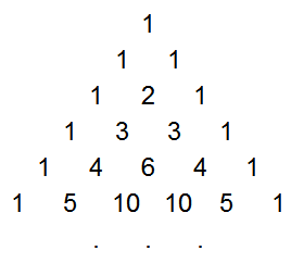
Pascal's triangle

The game probabilities come from the triangle of partial sums of binomial coefficients, which is a lesser-known sequence that is easily derived from Pascal's Triangle. This sequence, T(n, k) is formed by summing the first k elements in the corresponding row of Pascal's Triangle. That is, the first element is the first element in the same row of Pascal's triangle, the second is the sum of the first two elements in Pascal's triangle, the third is the sum of the first three, etc.

T - the partial row sums of Pascal's Triangle
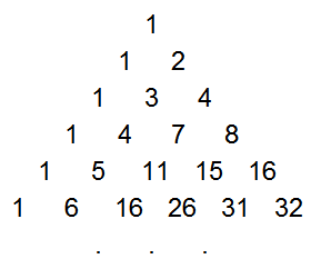
Partial row sums in Pascal's triangle
Mathematically, this triangle T(n, k) is defined by:


As with Pascal's Triangle, each element is the sum of the two above it, but now the right-hand border is powers of 2. This triangle is discussed in detail in the Online Encyclopedia of Integer Sequences. Surprisingly, this triangle is closely connected with distances in a hypercube, error-correcting codes, and how many pieces an n-dimensional cake can be cut into.

With function T defined above, the volleyball winning probabilities are given simply by:

For example, P(23,20) = T(6, 4)/2^6 = 89.0625%, which matches the table.

Intuitively, it makes sense that the probabilities are related to Pascal's Triangle, because each entry in Pascal's Triangle is the sum of the two values above, while each probability entry is the average of the value above and the value to the right in the table. Because taking the average divides by 2 in each step, an exponent of 2 appears in the denominator. The equation can be proved straightfowardly by induction.

The importance of a point

Suppose the score is m to n. How important is the next point? I'll consider the importance of the point to be how much more likely the team is to win the game if they win the point versus losing the point. For instance, suppose the score is 18-12, so the first team has a 92% chance of winning (from the previous table). If they win the next point, their chance goes up to 95%, while if they lose the point, their chance drops to 88%. Thus, we'll consider the importance to be 7%. Mathematically, if the score is m to n, I define the importance as P(m+1, n) - P(m, n+1).

Table with importance of the next point when the score is m to n

012345678910111213141516171819202122232425
011%11%11%11%10%9%8%7%6%5%4%3%2%1%1%0%0%0%0%0%0%0%0%0%0%0%
111%12%12%11%11%10%9%8%7%6%4%3%2%2%1%1%0%0%0%0%0%0%0%0%0%0%
211%12%12%12%12%11%10%9%8%7%6%4%3%2%2%1%1%0%0%0%0%0%0%0%0%0%
311%11%12%12%12%12%11%10%9%8%7%5%4%3%2%1%1%0%0%0%0%0%0%0%0%0%
410%11%12%12%13%13%12%12%11%9%8%7%5%4%3%2%1%1%0%0%0%0%0%0%0%0%
59%10%11%12%13%13%13%13%12%11%10%8%7%5%4%3%2%1%1%0%0%0%0%0%0%0%
68%9%10%11%12%13%13%13%13%12%11%10%8%6%5%3%2%1%1%0%0%0%0%0%0%0%
77%8%9%10%12%13%13%14%14%13%12%11%10%8%6%5%3%2%1%1%0%0%0%0%0%0%
86%7%8%9%11%12%13%14%14%14%14%13%11%10%8%6%4%3%2%1%0%0%0%0%0%0%
95%6%7%8%9%11%12%13%14%14%14%14%13%12%10%8%6%4%3%1%1%0%0%0%0%0%
104%4%6%7%8%10%11%12%14%14%15%15%14%13%12%10%8%6%4%2%1%1%0%0%0%0%
113%3%4%5%7%8%10%11%13%14%15%15%15%15%14%12%10%7%5%3%2%1%0%0%0%0%
122%2%3%4%5%7%8%10%11%13%14%15%16%16%15%14%12%10%7%5%3%1%1%0%0%0%
131%2%2%3%4%5%6%8%10%12%13%15%16%17%17%16%14%12%9%7%4%2%1%0%0%0%
141%1%2%2%3%4%5%6%8%10%12%14%15%17%18%18%17%15%12%9%6%3%2%1%0%0%
150%1%1%1%2%3%3%5%6%8%10%12%14%16%18%19%19%17%15%12%9%5%3%1%0%0%
160%0%1%1%1%2%2%3%4%6%8%10%12%14%17%19%20%20%18%16%12%8%4%2%0%0%
170%0%0%0%1%1%1%2%3%4%6%7%10%12%15%17%20%21%21%19%16%12%7%3%1%0%
180%0%0%0%0%1%1%1%2%3%4%5%7%9%12%15%18%21%23%23%21%16%11%5%2%0%
190%0%0%0%0%0%0%1%1%1%2%3%5%7%9%12%16%19%23%25%25%22%16%9%3%0%
200%0%0%0%0%0%0%0%0%1%1%2%3%4%6%9%12%16%21%25%27%27%23%16%6%0%
210%0%0%0%0%0%0%0%0%0%1%1%1%2%3%5%8%12%16%22%27%31%31%25%12%0%
220%0%0%0%0%0%0%0%0%0%0%0%1%1%2%3%4%7%11%16%23%31%38%38%25%0%
230%0%0%0%0%0%0%0%0%0%0%0%0%0%1%1%2%3%5%9%16%25%38%50%50%25%
240%0%0%0%0%0%0%0%0%0%0%0%0%0%0%0%0%1%2%3%6%12%25%50%50%50%
250%0%0%0%0%0%0%0%0%0%0%0%0%0%0%0%0%0%0%0%0%0%0%25%50%50%

The values in the table make intuitive sense. If one team is winning by a lot, one more point doesn't make much difference. But if the scores are close, then each point counts. Each point counts a lot more near the end of the game than at the beginning. The first point only makes an 11% difference in the odds of winning, while the if the score is 23-23, the point makes a 50% difference (75% chance of winning if you get the point vs 25% if you miss the point). This table is sort of a derivative of the first table, showing where the values are changing most rapidly.

The importance of a point as defined above closely matches the behavior of the spectators. If the score is very close at the end of the game, the audience becomes much more animated compared to earlier in the game.

The "importance" is mathematically simpler than the probability of winning derived earlier. If the current score is 25-a, 25-b, then the importance is given by the simple equation:

This can proved straighforwardly from the equation for P(x, y). For example, if the score is 18-12, the importance is C(7+13-2, 6) / 2^(7+13-2) = 18564 / 262144 = 7.08%.

Conclusions

How useful is this model? Well, it depends on the assumption that each team has an equal chance of winning each point. Of course, most teams are not evenly matched. Even more important is the fact that if a team has a good server, they can quickly rack up 10 points in a row, which throws the model out the window.

However, I think the model is still useful, since it provides some quantitative answers to the original questions, and confirms some intuitions. In addition, the mathematics turned out to be more interesting than I was expecting, with the surprising connection to Pascal's Triangle.

Python version

P.S. The code above is in Arc, an obscure language. Here's a version of the code in Python that will be more useful:
solved = {} # Remember values that have been solved

# Compute probability of team 1 wining when score is s1 to s2.
# Max is the points needed to win (typically 25)
# This routine is just a wrapper around scorePercentInt to
# remember values that have been computed.
def scorePercent(s1, s2, max):
  if (s1, s2, max) not in solved:
    solved[s1, s2, max] = scorePercentInt(s1, s2, max)
  return solved[s1, s2, max]

# This routine does the actual calculation
def scorePercentInt(s1, s2, max):
  if s1 >= max and s1 >= s2 + 2: return 100
  if s2 >= max and s2 >= s1 + 2: return 0
  if s1 == s2: return 50
  return (scorePercent(s1, s2+1, max) + scorePercent(s1+1, s2, max)) / 2.

for i in range(0, 26):
  for j in range(0, 26):
    print '%.3f' % scorePercent(i, j, 25),
  print
My 0.015 minutes of fame on CNN

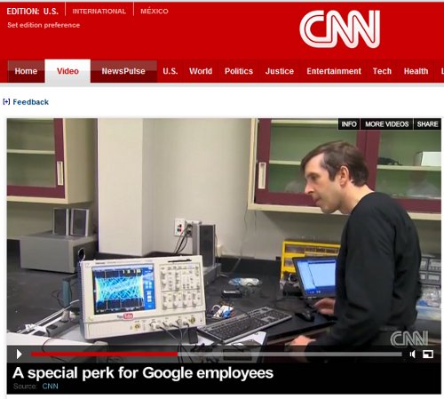
I recently wound up on CNN for a couple seconds doing some Arduino hacking as part of a segment on Google's workshops. Click the image for the full video. If you don't want to watch the whole thing, I appear at 1:00 and 1:39.

Ken Shirriff on CNN

For those who want technical details, I hacked together the following quick sketch to generate the interesting patterns you can see on the oscilloscope:

void setup()
{
  pinMode(4, OUTPUT);
  pinMode(5, OUTPUT);
}

int state = 1;
int count1 = 0;
int state2 = 1;
int count12 = 0;
int max1 = 20;
int max2 = 200;
int t = 0;

void loop() {

  if (count1-- <= 0) {
    state = 1-state;
    digitalWrite(5, state);
    count1 = max1;
  }
  if (count12-- <= 0) {
    state2 = 1-state2;
    digitalWrite(4, state2);
    count12 = max2;

    if (t++ > 20000) {
      max2 -= 1;
      if (max2 < 1) {
        max2 = 500;
      }   
      t = 0;
    }
  }
}
This sketch manually generates two square wave output with periods determined by max1 and max2. The frequency of the second varies occasionally (controlled by the loop with t). I used simple R-C filters on the outputs to turn the square waves into roughly triangular waves, and then fed this into the X and Y inputs of the oscilloscope. The result was constantly-varying Lissajou-like patterns.

I should point out the outputs generated this way are rather unstable because many thing can interrupt the timing loop. The above code is provided just in case your are curious. I don't recommend using this approach for anything real; using the PWM timers would yield much cleaner results.

Anyone have other ideas for easy ways to generate cool oscilloscope patterns with an Arduino?

My Knuth reward check

I attended a very interesting talk "All Questions Answered" by the famous computer science professor Don Knuth in March, where he talked about many things, including his new book.

The talk inspired me to read The Art of Computer Programming, Volume 4A: Combinatorial Algorithms. As he described in the talk, he gives a reward check (for 1 hexadecimal dollar) to anyone who finds an error in one of his books, so I set myself the goal of finding an error in the book while on vacation.

After a lot of study, I thought I'd found an error in a diagram, but then I realized I was confused. Next, I found a blatant error in an appendix, but that error had already been discovered and was listed in the errata. Finally I found an error on page 574 that I hoped hadn't been found yet and sent it off to Professor Knuth.

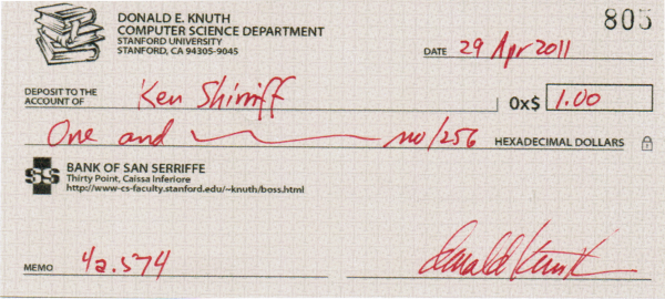
I was delighted to receive my reward check today, which Wikipedia calls "among computerdom's most prized trophies". That's a big exaggeration but nonetheless, I'm happy to get one. Note that the check is from the fictional Bank of San Seriffe to avoid check fraud problems from all the images of his checks on the web.

My Knuth TAOCP reward check

As for the book itself, it's interesting even if you're not after a reward, although very challenging to read. Volume 4a describes combinatorial algorithms, including more ways of computing permutations and combinations than you can shake a stick at. It also has an extensive discussion of BDDs and ZDDs, which are newish data structures for representing sets. The section on bitwise tricks and techniques is interesting if you like HAKMEM-style tricks such as reversing the bits in an integer through a short sequence of incomprehensible operations.

I have to admit that trying to find an error in a book is a strange vacation goal, but I'm glad I succeeded and Knuth's book taught me some interesting algorithms in the process.

P.S. I was very surprised to see this article on the front page of Hacker News. To answer the questions there and below, the error I found was in volume 4a page 574 (as the memo line on the check shows). The solution to exercise 67 on that page says a particular circuit uses 6 ANDN gates, which I thought should be NAND gates. It gets a bit more complicated because Knuth was referring to the ANDN op code for MMIX, but there was still a mistake with and-not versus not-and. (The other error I noticed was n choose k on page 824, but I checked the errata and it had already been found.)

The Endeavour delay: Complexity, the APU, and the Load Control Assembly

The last launch of the Endeavour space shuttle has been delayed 48 hours (update: indefinitely) due to a problem with the APU heater and the Load Control Assembly. I wanted to find out what exactly these troublesome components are, so I did some investigation. There's a lot of extremely detailed information on the Space Shuttle available online, but it is very hard to find. I've summarized the information here in case anyone else wants to know the specifics.

Space Shuttle APU locations

The Space Shuttle has three independent hydraulic systems to operate engine valves, actuators, landing gear, and so forth during launch and landing. The hydraulic pumps are powered by three Auxiliary Power Units (or APUs), which are hydrazine-powered turbines. Each APU is 88 pounds and produces 135 horsepower (which is about the same horsepower as a Honda Accord).

Hydrazine is a highly-toxic rocket fuel; when exposed to a catalyst, it energetically decomposes into hot gases at 1700°F. It is convenient for applications such as the APU, since it doesn't need oxygen, and the decomposition can be easily started and stopped.

Space Shuttle Auxiliary Power Unit
(Click on the image for tons of detailed information.)

Apparently the fuel heaters in APU 1 are not working. Since the hydrazine fuel will freeze at 34°F, each APU has redundant heaters to keep the system above 45°F. Since the heaters are redundant, the Space Shuttle would still be able to operate with the current problem, but would not be able to handle another failure. If the second fuel heater failed, then the fuel would freeze and the APU would not be able to work. Since there are three APUs, even this failure would not be a major problem. But still, you wouldn't want to take off with the heater not working, because losing hydraulic pressure would be a very bad thing.

According to articles, the fuel heater problem is due to a lack of power from the Aft Cabin Load Control Assembly, a switchbox that powers a heater circuit for Auxiliary Power Unit 1. There are three Aft Load Controller Assemblies, as well as many other Load Controller Assemblies. (Sources are inconsistent about whether it is called a Control vs Controller.)

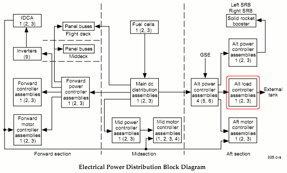
A complex Electrical Power System provides power to all parts of the Shuttle. Three fuel cells (10 kW each) generate 28-volt direct current. The fuel cells feed three main DC power buses, as well as powering AC inverters to feed three AC buses with three-phase, 117-volt, 400-hertz AC power. From the fuel cell, power goes to a Distribution Assembly (DA), then to the aft Power Controller Assemblies, and then to the Aft Load Controller Assemblies.

The Load Control Assemblies contain solid-state switching devices for loads up to 20 amps, and relays for loads up to 135 amps. These switching devices are internally fused.

Reportedly there is a short or other electrical fault in the Aft Load Controller Assembly 2, which is causing the APU heater to fail to operate. The fuel is being drained from Endeavour so technicians can access the assembly and resolve the problem. If I'm interpreting everything correctly, it seems like they'll need to replace one of the internal fuses in the Load Control Assembly.

Space Shuttle Power Distribution

Complexity and the Space Shuttle

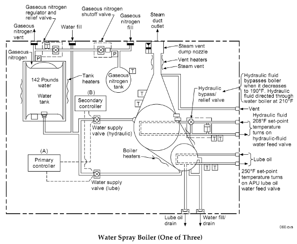
One amazing thing about the Space Shuttle is the layers and layers of complexity. The APU system is just one example of this. For instance, each APU has as lube oil system to keep it lubricated. This requires a lube oil pump, which requires a nitrogen pressurization system to start the pump in zero gravity. The oil also requires a 181-pound water spray boiler system, which sprays cooling water onto the oil pipes; the water boils into steam and is vented into space. The boiler requires controllers, panel switches, and status displays, as well as yet another nitrogen pressurization tank, and yet another system of heaters to keep the water from freezing.

Space Shuttle Water Spray Boiler

The water spray boiler doesn't have anything to do with the current launch delay, other than being part of the APU, but it provides an interesting example of the complexity of the systems involved. To summarize the complexity along just this one path, the engines require hydraulic pressure, which requires APUs to power the hydraulic pumps, which require a lubricating oil system, which requires a complex boiler system, which requires a own control and monitoring system. And this is just one small sub-path! I'm ignoring equally complex systems such as the APU injector cooling system (more water and pressurized nitrogen), or the APU fuel pump (which for instance, has a catch bottle in case its seals leak, a drain port if the catch bottle overflows, and associated monitoring system).

Conclusion

Given the level of complexity of the Space Shuttle, I'm not surprised by the launch delays, and wish NASA the best of luck in resolving the problem promptly. My opinion is while the Space Shuttle is a marvel of engineering, simpler rocket systems such as the SpaceX Falcon will turn out to be more practical in the long run.

The images and much of the information above is from the 1988 Shuttle Reference Manual at shuttlepresskit.com. This manual goes into extreme detail and is very interesting (if you find this sort of thing interesting). I should probably make it clear that this posting is based on what I've read; I have no connection with the space program.

P.S. I've found extensive details on the LCA and launch issues are available at nasaspaceflight.com, e.g. Endeavour receives her new LCA – Blown driver examined.

Inside the Firesheep code: how it steals your identity

You may have heard about Firesheep, a new Firefox browser add-on that lets anyone easily snoop over Wi-Fi and hijack your identity for services such as Facebook and Twitter. This is rather scary; if you're using Wi-Fi in a coffee shop and access one of these sites, the guy in the corner with a laptop could just go click-click and be logged in as you. He could then start updating your Facebook status and feed for instance. Even if you log in securely over SSL, you're not protected.

The quick explanation

Bad guy at computer
The Firesheep site gives an overview of its operation: after you log into a website, the website gives your browser a cookie. By snooping on the Wi-Fi network, Firesheep can grab this cookie, and with the cookie the Firesheep user can hijack your session just as if they are logged in as you.

You may be wondering what these mysterious cookies are. Basically, a cookie is a short block of characters. The cookie consists of a name (e.g. "datr") and a value (e.g. "QKvHTCbufakBOZi5FOI8RTXQ"). For a login cookie, the website makes up a unique value each time someone logs in and sends it to the browser. Every time you load a new page, your browser sends the value back to the website and the website knows that you're the person who logged on. This assumes a couple things: first, that a bad guy can't guess the cookie (which would be pretty hard for a long string of random characters), and second, that nobody has stolen your cookie.

Web pages usually use https for login pages, which means SSL (Secure Socket Layer) is used to encrypt the data. When using SSL, anyone snooping will get gibberish and can't get your userid and password. However, because https is slower than regular http (because all that encryption takes time), websites often only use the secure https for login, and use insecure http after that. Banking sites and other high-security sites typically use https for everything, but most websites do not.

The consequence is that if you're using unencrypted Wi-Fi, and the website uses insecure http, it's very easy for anyone else on the Wi-Fi network to see all that data going to and from your computer, including the cookies. Once they have your cookie for a website, they can impersonate you on that website.

This insecurity has been known for a long time, and it's easy for moderately knowledgeable people to use a program such as tcpdump or wireshark to see your network traffic. What Firesheep does is makes this snooping so easy anyone can do it. (I would recommend you don't do it, though.)

The detailed explanation

A few things about Firesheep still puzzled me. In particular, how do other people's network packets get into your browser for Firesheep to steal?

To get more information on how Firesheep works, I took a look at the source code. Since it's open source, anyone can look at the code at http://github.com/codebutler/firesheep.

The packet sniffing code is in the firesheep/backend/src directory. This code implements a little program called "firesheep-backend" that uses the pcap library to sniff network traffic and output packets as JSON.

pcap is a commonly-used packet capture library that will capture data packets from your network interface. Normally, a network interface ignores network packets that aren't intended to be received by your computer, but network interfaces can be put into "promiscuous mode" (note: I didn't invent this name) and they will accept any incoming network data. Normally packet capture is used for testing and debugging, but it can also be used for evil snooping. (As an aside, the unique MAC address - the number such as 00:1D:72:BF:C9:55 on the back of a network card - is used by the network interface to determine if the packet is meant for it or not.)

Going back to the code, the http_sniffer.cpp gets a data packet from the pcap library, looks for TCP packets (normal internet data packets), and then http_packet.cpp uses http-parser to parse the packet if it's an HTTP packet. This breaks a HTTP packet into its relevant pieces including the cookies. Finally, the relevant pieces of the packet are output in JSON format (a JavaScript-based data format that can be easily used by the JavaScript plugin in the browser).

That explains how the packets get captured and converted into a format usable by the Firefox add-on. Next I will show how Firesheep knows how to deal with the cookies for a particular website.

The xpi/handlers directory has a short piece of JavaScript code for each website it knows how to snoop. For instance, for Flickr:

// Authors:
//   Ian Gallagher 
register({
  name: 'Flickr',
  url: 'http://www.flickr.com/me',
  domains: [ 'flickr.com' ],
  sessionCookieNames: [ 'cookie_session' ],

  identifyUser: function () {
    var resp = this.httpGet(this.siteUrl);
    var path = resp.request.channel.URI.path;
    this.userName = path.split('/')[2];
    this.userAvatar = resp.body.querySelector('.Buddy img').src;
  }
});
This code gives the name of the website (Flickr), the URL to access, the domain of the website, and the name of the session cookie. The session cookie is the target of the attack, so this is a key line. Next is a four line function that is used to fetch the user's name and avatar (i.e. picture) from the website once the cookie is obtained.

Firesheep currently has handlers for about 25 different websites. By writing a short handler similar to the above, new websites can easily be hacked (if their cookie is accessible).

The visible part of the extension that appears in the browser is in firesheep/xpi/chrome. The most interesting parts are in the content subdirectory. ff-sidebar.js implements the actual sidebar and displays accounts as they are sniffed.

The "meat" of the JavaScript plugin is in firesheep/xpi/modules. Firesheep.js implements the high-level operations such as startCapture() and stopCapture(). FiresheepSession.js is the glue between the plugin and the firesheep-backend binary that does the actual packet collection. Finally FiresheepWorker.js does the work of reading the packet summary from firesheep-backend (via JSON) and processing it by checking the appropriate website-specific handler and seeing if the desired cookie is present.

Finally, how do the pieces all get put together into the add-on that you can download? Firefox extensions are explained on the developer website. The install.rdf file (in firesheep/xpi) gives the Firefox browser the main information about the extension.

Well, that summarizes how the Firesheep plugin works based on my analysis of the code. Hopefully this will help you realize the risk of using unsecured Wi-Fi networks!